
SHARE


In this post we’ll look at some of the key ingredients that make the online travel booking process easier for customers.
It’s doubtful that the perfect booking process actually exists (please tell me if it does), but it’s something sites should at least be aiming for. However, there are some excellent features on some travel sites, and I’ve compiled some of the best here.
Our stats show that booking abandonment rates on travel websites are some of the highest for any industry. At 81.6%, they’re higher then the overall average of 76.8%.

We also have some insight into why people abandon travel bookings, and there’s a lot there that sites can try to address.

Yes, with a relatively lengthy research process (the average holiday purchase takes 45 days and takes in 38 different sites according to Millward Brown) there will always be some abandonment, but the key is to avoid unnecessary abandonment.
So, the ideal travel booking should include the following…
1 An Easy to Use Search Box
First, and most basic, make it clear where the search should begin, and how. This is why many sites make the search box the most obvious feature on the homepage.

Some sites go further, and allow more search options that help the traveller more accurately find what they want.
For example, easyJet has a lowest fares feature so people can see a visualization of the cheapest fights before selecting departure and return dates.

Kayak goes further, allowing users to select a maximum price and flight time limit, and mapping the results with the prices.
This enables users to search more accurately and should ensure that the results generated are more relevant.

2 Great Presentation of Search Results
Search results pages are equally important. Results should be presented clearly and they should be easy to filter and manipulate.
Key features of good results pages include:
- Effective presentation of results. Users should be able to make sense of the information presented without too much effort. It’s also good to be able to change the viewing options (grid view, view next week/month etc).Again, easyJet performs well here, with the option of viewing available dates and prices on a grid. This is a very useful feature for the price-conscious searcher, which is easyJet’s target audience.


- Show results on a map. This makes travel research easier for users as it allows them to choose based on key considerations – closeness to the beach, distance from town centre etc.
- Sorting of results. The ability to order results according to preferences is vital. This may be price and duration of flights, departure times and more.
- Filtering of results. Users need a good range of options to refine their results. Viewing only direct flights, only hotels with a certain review rating, and so on. This allows uses to customise the search to their needs.
- Speed. Results should load quickly, and adding and removing of filters should also be smooth. If customers see screens like this for too long it can become frustrating.


- Ability to change original search. Searches may produce a small number of results, or the user may not be satisfied, so make it easy for them to amend their search.

3 Provide Inspiration for Travellers
While some visitors will arrive at a travel website with a clear idea of where they want to go and when, others will be more flexible. Perhaps they have a week free in July and want to go somewhere warm, but are open to different destinations.
There are a number of ways to do this. One simple way is just to provide a few suggested holidays on the homepage, as First Choice does.

Destination guides are useful too, as they can help visitors find out more about things to see and do.
Here’s an example from Airbnb. It works well as it is user generated, with recommendations on where to eat, what to do etc. This kind of local knowledge is more likely to be trusted by users too.

4 Make Sure It Works for Mobile Users
Mobile is now essential for travel sites, and so the booking process needs to work on mobile just as well as desktop.
The following stats from Adobe should underline this point.
- 52% of travel related browsing takes place on mobile.
- Despite the browsing activity, just 21% of travel sales took place on a mobile device.
This underlines the point that mobile is crucial in the holiday research process, but the sales stats suggest that there is still work to be done to improve the booking process.
Of course, sites should be optimized for mobile, but that’s not enough on its own. Every aspect of the booking process should be made easier for mobile visitors to use.
Little details and shortcuts matter, such as defaulting to the most appropriate touch keyboard for each form field, or using address lookup to reduce user effort.

5 Use Images to Inspire
Images need to be used to sell the benefits of destinations, but also to provide key information for users.
For example, an image of a hotel room can convey information about size and facilities quicker than text.

Images are also a great sales driver, something which Airbnb uses to great effect.
This picture of the pool and the view behind it must almost sell the villa on its own.

6 Show User Reviews
User reviews provide an extra level of detail for potential travel bookers and, crucially, add an extra layer of trust.
A common approach now is to use reviews from TripAdvisor on travel sites, as eDreams does in the example below.
The combination of average review scores with the actual reviews within the listings works well. Shoppers can also filter search results by average user review scores.
Moreover, as the primary travel review site, it’s likely to be a destination for many people researching travel purchases. Providing reviews on-site removes one reason for shoppers to leave your site to conduct more research.

Airbnb also uses reviews effectively, showing the views of people who have previously rented properties on the site.
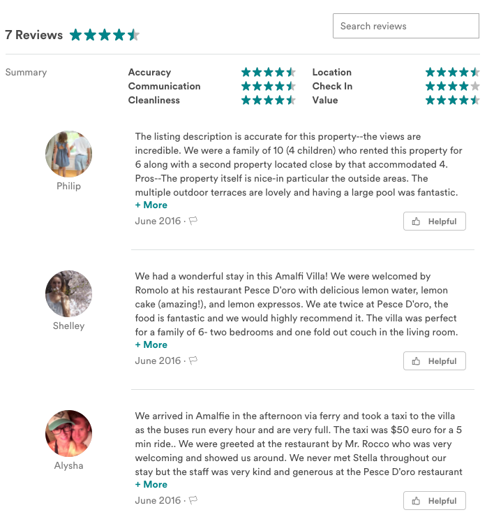
The importance of presentation of reviews should be noted too.
Showing the number of reviews next to the average score help people to digest the information quickly, while little details such as showing review scores for features like cleanliness and location (as Airbnb does) help people to decide if a property is right for them. 
7 Be Upfront About the Total Cost
Hidden charges are a real source of irritation for online shoppers, and travel websites have been some of the worst offenders on this score.
Car rental sites are a bugbear of mine, as rental firms seek to squeeze as much money out of customers as they can through extras like child car seat hire, insurance excesses and the practice of charging over the odds for fuel.
Holiday sites have been guilty of this in the past, as this example from Hotels.com shows, but now online shoppers are generally more savvy about this, while ‘tricking’ customers is likely to lead to bad publicity.
It’s about managing customer expectations, and it’s pretty simple. Unless they add extras like insurance, then the price at the beginning and end of the checkout should be the same.

Most travel sites I looked at for this were upfront on total costs, with extras and the additional costs involved made clear.
8 Go Easy on the Cross-Selling
There’s nothing wrong with sending cross-sell emails, and many travellers will appreciate the option of being able to book car hire and other services while they’re booking.
However, it’s important not to overdo it. Also, forcing users to interact with extras can be an annoyance.
Here, Thomson provides a good example. Extras including seats with more space, luggage allowances and in-flight meals are presented clearly, but users can just ignore and continue the booking if they want to.

This is the flip-side, having to actively select ‘travel without insurance’, and even making it the last of the five options on the drop-down menu.

9 Provide Contact Options During the Booking Process
Travel bookings can be expensive and complex- for many people they may be the biggest purchase they make that year – so it’s natural that people may have doubts during the booking.
Expedia provides a contact number on booking pages, though perhaps it could be easier to spot.

10 Add a Touch of Urgency
Ecommerce sites can use urgency in a number of ways, perhaps with a time-limited special offer, a threshold for next day delivery, or messaging around low stock levels.
For travel sites, urgency is a useful tactic to employ, as the date of the booking adds an obvious deadline for decision, while ticket and price availability changes quickly.
It’s important to note that urgency should be used honestly. Telling shoppers that there are just two seats left on a flight they’re considering is a useful piece of information, and one that may just help them to come to a decision more quickly.
However, if they see such details on every listing, the effect is diluted and trust in the information provided will be lost.
This hotel listings page from Hotels.com provides a couple of strong examples of urgency.
First we have the yellow banner advising that 36% of hotels are already booked up for the selected date, while a countdown timer tells customers how long they have left before the deal of the day runs out.

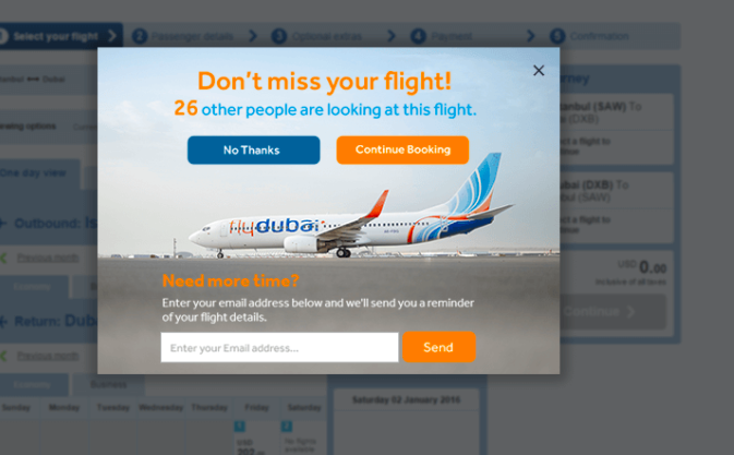
This is also something we used with Fly Dubai. In the example below, this message is displayed to customers as they show exit intent (the cursor heads for the back button for example).
It provides the message that the flight is popular and the shopper may miss out if they abandon now, but also gives them the option of emailing the flight details for later purchase, thus helping the research process.
11 Provide a Range of Payment Options
Our booking abandonment survey found that 7% of respondents had abandoned a travel purchase due to a lack of payment options.

It can pay to offer more than just credit or debit card payments, and offer alternatives like PayPal.
Indeed, many now offer PayPal as well as card options, but others offer a wider range of methods. KLM offers 10 different options, depending which country flights are booked from.
For example, it offers credit, debit card, PayPal and bank transfer for UK customers.

This approach allows KLM to appeal to different markets, as there are plenty of variances in preferred online payment methods.
12 Focus on Form Usability
Forms are a big part of the booking process, and any usability issues here can have a negative impact on conversions.
Travel booking forms tend to be longer than the average e-commerce form, as users need to enter details for each traveller, choose seats and in-flight meals, and so on.
The key is to minimize form abandonment through good design and composition of the form.
Here are a few ways to make forms more user-friendly.
- Keep forms as short as they need to be. As this article from UX Booth says, it’s not simply about making forms short, as many other factors influence form usability.Forms should be as long as they need to be, but it pays to avoid adding unnecessary fields. The Question Protocol can help here.
- Provide progress indicators. These help to show the customer where they are in the booking process and how many sections are left to complete.
- Provide a persistent reminder of order and total cost. We can see this in the Thomson example above – this reassures customers that the flight times and dates are correct, and the total price.
- Visual appeal. A little bit of visual design can help to turn a dull form into something that is more enjoyable to complete.
- In-line validation. Users will make mistakes completing forms, and in-line validation points this out where the mistake is made, rather than waiting for them to submit the form.Here, booking.com confirms that I’ve managed to complete the name fields successfully, but points out a typo in my email address. It’s also helpful that it guesses the correct entry for me.


I could list more tips, but overall it’s about providing the best possible user experience for your users.
Obvious sources of friction within forms can often be identified through analytics or user testing, and form design should seek to minimize these issues. You should also consider your mobile form design strategies as well as desktop as the two are vastly different and require different optimisations to be applied.
Form usability is absolutely vital but often overlooked, and it represents some of the quickest and easiest ways to reduce abandonment rates.
In Summary
The perfect booking process may not exist, though some sites are clearly incorporating more of these features than others.
Travel booking can be a lengthy process and, out of necessity, users are required to enter a lot of information at times. However, a focus on creating the best possible user experience can do a lot to reduce abandonment rates.
NEW EBOOK
⬛️ 2023 Black Friday Ecommerce Strategy & Stats Report
This FREE ebook gives you the methods, solutions & trends for building a high-converting remarketing strategy for Black Friday

Speak to an expert
Learn how to convert your online audience into revenue with our experts.

Graham Charlton
Graham Charlton is Editor in Chief at SaleCycle. He's been covering ecommerce and digital marketing for more than a decade, having previously written reports and articles for Econsultancy. ClickZ, Search Engine Watch and more.


![Valentine’s Day Ecommerce Tips and Trends [2024 Strategy]](https://www.salecycle.com/wp-content/uploads/2019/01/valentines-ecommerce-1.png)


![How SaleCycle helped Vodafone increase their online sales by an additional 2,000 additional sales per month [Extended Version]](https://www.salecycle.com/wp-content/uploads/2023/08/vodafone-banner.webp)