SHARE


How ecommerce sites can use messaging around live trends to drive conversions.
Showing live trends data to potential shoppers gives them useful information which can help them to come to a decision, and also adds an element of urgency which can speed up conversions.
For example, if there’s only one pair of shoes left in a customer’s size, then they need to buy quickly to avoid the risk of missing out.
This data is generally used to show product availability, and a form of marketing through scarcity.
Scarcity is one of Caldini’s Principles of Persuasion (referenced in this article on Amazon and Psychology), and works on the fear of missing out (FOMO). In addition, if something is rare or exclusive, it can seem more valuable to people.
It’s a principle which can be applied to many different products, but it is a tactic that should be approached with the customer in mind.
If you provide useful data which informs their decision, this is good for you and the customer. However, if the data is false, or the tactic over-used, then people will lose trust in the information presented.
Here are some examples of sites using live trends data…
Hotels.com
Live trends data is a great fit for hotel sites, as the limitations of the user’s search and hotel availability provides an opportunity to present a range of data.
Some hotel sites do seem to bombard users with urgency and scarcity messaging, but I think hotels.com gets the balance right here.
It actually provides useful information which can help people make a decision.
The yellow banner showing the percentage of hotels have been booked for the selected dates give me a quick indication of how long long I may have to decide, while the number of rooms left could push people into making a faster decision.

Zappos
The Zappos messaging on stock levels is quite subtle, though it has been place near the call to action, where it should be seen by shoppers.

House of Fraser
The messaging here looks like it obscures the page, but it’s only visible for a couple of seconds before it vanishes. Just long enough to get the message across.

Ruelala
This site is all about scarcity, as it offers time-limited deals on branded items.
The size chart is useful, as it allows the shopper to see what sizes are available at a glance.

Amazon
Amazon uses stock level messaging on its product pages. It’s been done well though, as I’ve seen enough pages without such messaging to believe the information when I see it.

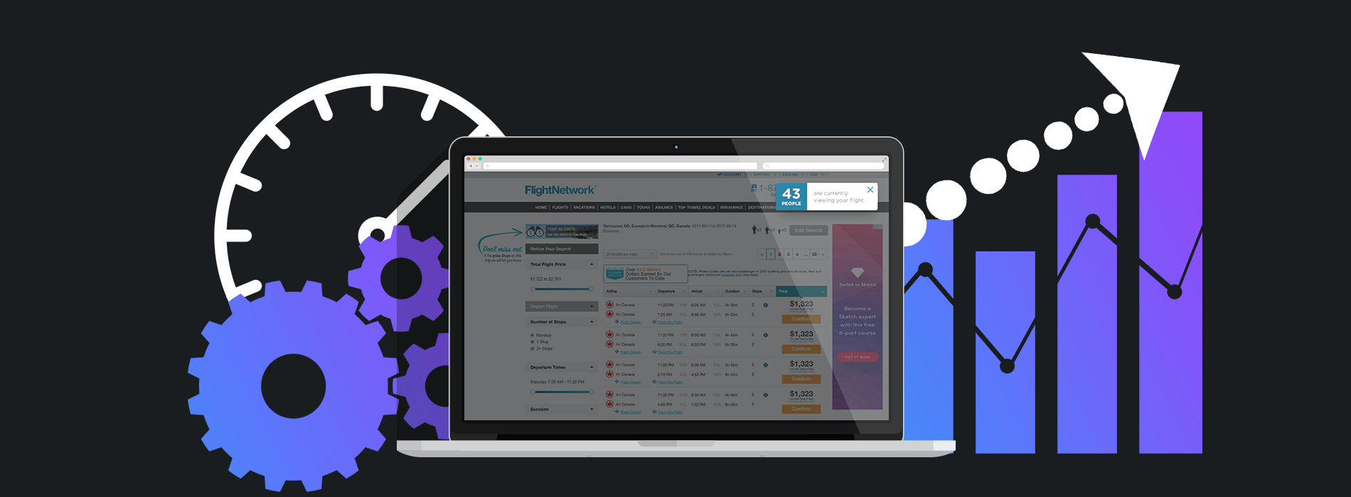
Flight Network
Flight Network uses subtle overlay messaging to provide information on the number of people viewing a flight.

NEW EBOOK
⬛️ 2023 Black Friday Ecommerce Strategy & Stats Report
This FREE ebook gives you the methods, solutions & trends for building a high-converting remarketing strategy for Black Friday

Speak to an expert
Learn how to convert your online audience into revenue with our experts.

Graham Charlton
Graham Charlton is Editor in Chief at SaleCycle. He's been covering ecommerce and digital marketing for more than a decade, having previously written reports and articles for Econsultancy. ClickZ, Search Engine Watch and more.


![Valentine’s Day Ecommerce Tips and Trends [2024 Strategy]](https://www.salecycle.com/wp-content/uploads/2019/01/valentines-ecommerce-1.png)


![How SaleCycle helped Vodafone increase their online sales by an additional 2,000 additional sales per month [Extended Version]](https://www.salecycle.com/wp-content/uploads/2023/08/vodafone-banner.webp)