SHARE


A look at why fashion retailers seem to be ahead of the pack for mobile conversions, and what other sectors can learn from this…
We’ve seen the growth of mobile traffic to retailers over the past few years, but the volume of sales hasn’t always kept pace with this.
Adobe stats from the 2016 Christmas shopping season illustrate this point.
Traffic on mobile and tablet devices is equal to that from desktop, but only leads to 31% of sales.

It’s been referred to as the ‘mobile commerce gap’, but one sector which seems to be closing this gap is fashion.
Using data from more than 500 global brands, we see 51.3% of traffic coming from mobile devices, and this traffic accounts for 36.8% of sales. There’s the mobile commerce gap.
However, fashion bucks this trend, with the volume of sales higher on mobile than desktop.
Mobile accounts for 65.4% of traffic to fashion retailers, and 57.1% of sales. This indicates that shoppers still have a slight preference for buying on desktop, but the gap is closing for this sector.

Compare this to travel, where the traffic split is 59% desktop / 41% mobile. It’s clear that people overwhelmingly prefer to checkout on desktop, with just 18% of sales coming via mobile.
It should be noted that, when comparing travel and fashion, the research and purchase processes are very different, and this accounts for some of the disparity.
Travel sites have generally higher cart abandonment rates, in part because shoppers tend to take longer to research such purchases – up to 45 days according to some studies.
Also, the purchase process is longer by necessity, with more information required (passport numbers, passenger details etc) and therefore more form-filling. The fact that fewer travel purchases end up being made on mobile suggests that it’s just easier to do on desktop.
This longer process isn’t the only reason fashion retailers seem to do better on mobile though. Fashion retailers have, in general, been innovative and relatively quick to improve their mobile sites.
Why Do People Prefer to Buy on Desktop?
First of all, I should point out that this isn’t a competition between the two. It’s about providing the best experience for whichever channel the customer chooses.
The cost of a poor experience on a particular channel is lost sales, and as mobile usage grows, the risk of not providing the best possible experience for mobile users grows.
It helps to think about why people are likely to choose to buy on desktop, and how these issues can be addressed on mobile.
Here are some possible reasons for preferring desktop:
- Ease of navigation. It can be easier to navigate on a larger screen.
- Image size and quality. People need to see clear images to make a decision on a purchase.
- Complexity of products. Purchases which require more work – holidays, insurance etc – are often tricky on a smaller mobile screen. Also, stats suggest some people prefer desktop for big-ticket purchases.
- Concerns about mobile commerce. This is becoming less of an issue, but some still have concerns about security.
- Checkout. Perhaps the main problem. This covers issues such as ease of form filling, registration, payment options, and data entry.
What Are Fashion Retailers Doing Well on Mobile?
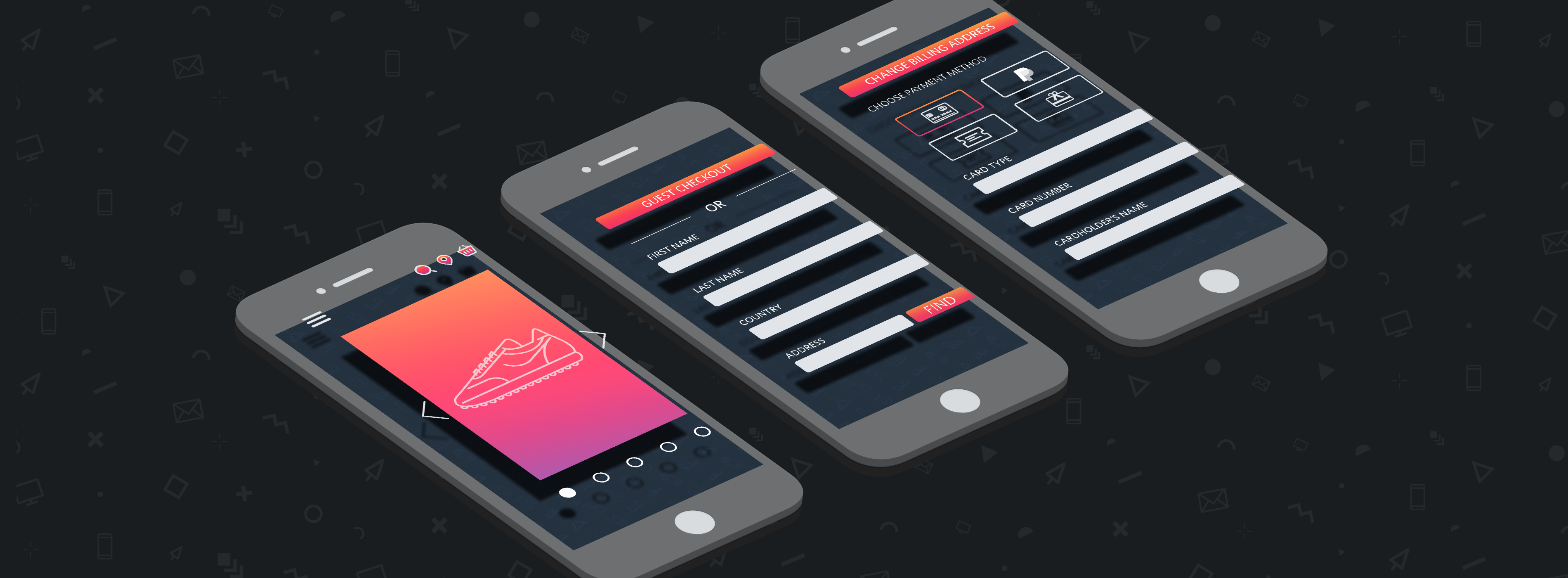
Let’s take Monsoon as an example. It’s a fashion retailer with a well-designed, easy to use website. As such, it’s a great example of how fashion retailers have adapted effectively to mobile commerce.
Search and Navigation
First of all, we have clear navigation and filters to help customers to search and refine their product selections.
With limited space compared to desktop, mobile navigation needs to be simple to use yet still allow users to access every category.
In this example, Monsoon hasn’t crammed its menu with too many options, and provides enough space between menu items to avoid too many accidental clicks.

Filter options help shoppers to narrow their selection efficiently and find the products that match their criteria.
This should help to address the issue of choice paralysis, where too many options can deter users. Using filters, shoppers can select, for example, the size they need so that irrelevant results are not shown.

Product Pages
Mobile product pages have been the poor relation to desktop in the past. Reduced screen space has led retailers to trim down information and images. However, this can make it harder for shoppers to find the information they need to decide on a purchase.
It’s a challenge, but mobile product pages need to adapt to the limitations of the device, while providing the same choice of information and imagery as desktop pages.
So Monsoon has a range of product images for each item showing a mixture of views. Crucially, they are high resolution images which shoppers can zoom into to see product detail.

Customers also need key pieces of information to help them decide. Little details can help too, such as showing the size of jacket the model is wearing, and her height.

Information on delivery and returns is also key. Shoppers are more likely to buy if delivery options suit them, while ease of return reassures them that there won’t be too much hassle if they get the wrong size.
This can be quite lengthy, so placing it under expandable menu options can help to keep the page simple yet provide enough info for shoppers.

Checkout and payment
This is an area that retailers have to get right if they want to maximize conversions from mobile users.
There are a number of ways that Monsoon and other fashion retailers make mobile checkout as painless as possible.
Trust and security is one possible area of concern, and many retailers address this using a mixture of trustmarks and copy on calls to action.
Here, Monsoon uses three logos, and the ‘proceed to secure checkout’ microcopy on the CTA.
The Comodo logo is a SSL certificate which reassures people that the site is secure, while the Visa and Mastercard logos relate to card payment security.

It’s unlikely that most shoppers actually understand what each logo means, but they do offer some reassurance, and tests have shown that they have an effect during checkout.
The counter-argument is that, by raising the issue of security, you’re actually alerting customers to the potential risks. There’s more discussion on that point here, but sites should take care to test the potential effects of security logos.
Also, trust is something websites and retailers earn through factors other than logos, such as repeated use, social proof, good design, and reliable site performance. If the site is slow to load, or pages time out during checkout, no amount of logos will help.
Guest checkout is an essential feature for online retailers in general, but perhaps it’s even more important for mobile shoppers. It reduces the amount of effort (or the perception of effort) involved in completing a purchase, and therefore helps to reduce abandonment rates.
Monsoon provides the guest checkout option, meaning shoppers need only to enter an email address before proceeding to entering address and payment details.
Note also the prominent progress indicator, which tells shoppers where they are in the process, and how many steps remain. It can provide a useful reassurance that it won’t take too long.

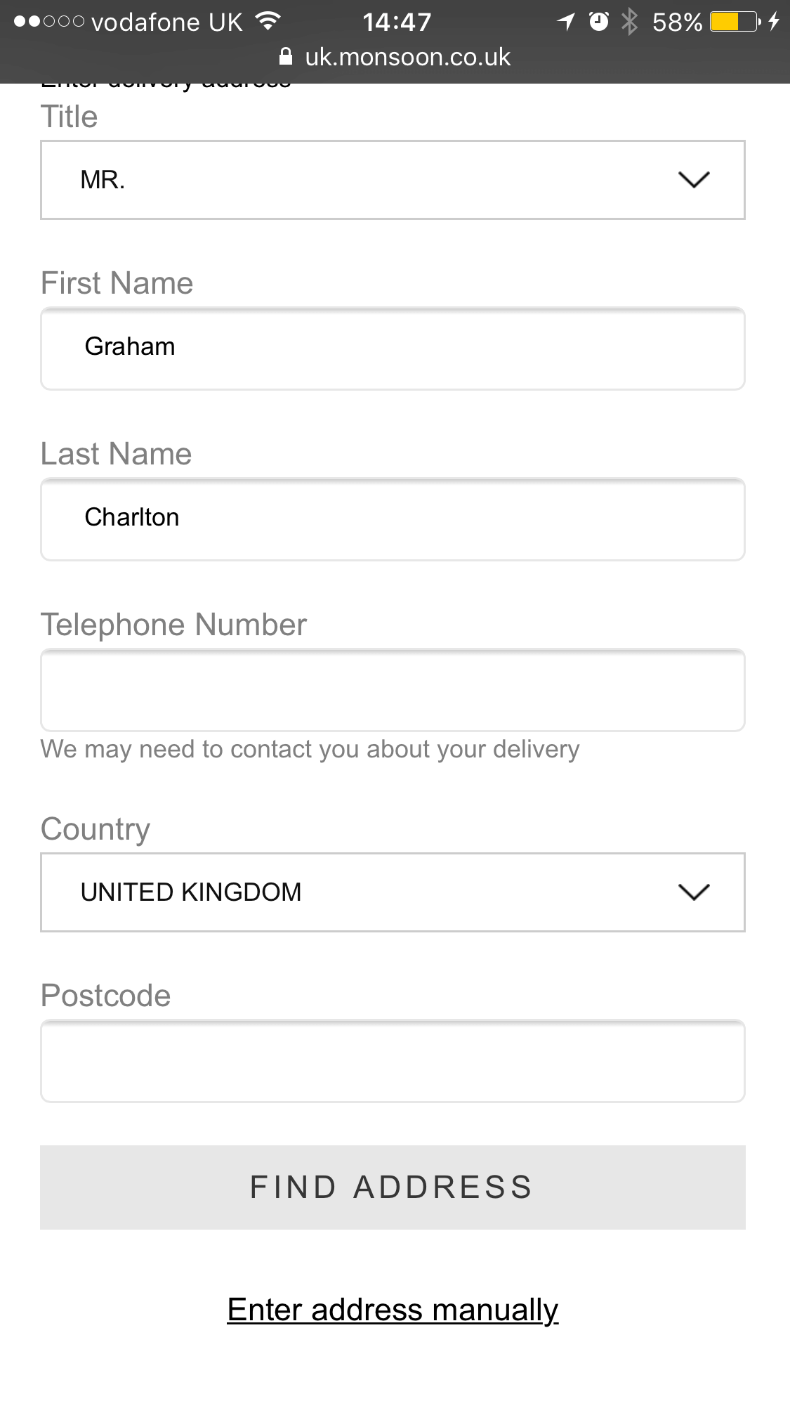
Well designed forms matter. They make it easier for shoppers to enter their details without making mistakes, and therefore reduce the potential for abandonment.
Here, Monsoon has large form fields for touchscreen users, and also adds a postcode lookup tool to provide a shortcut.
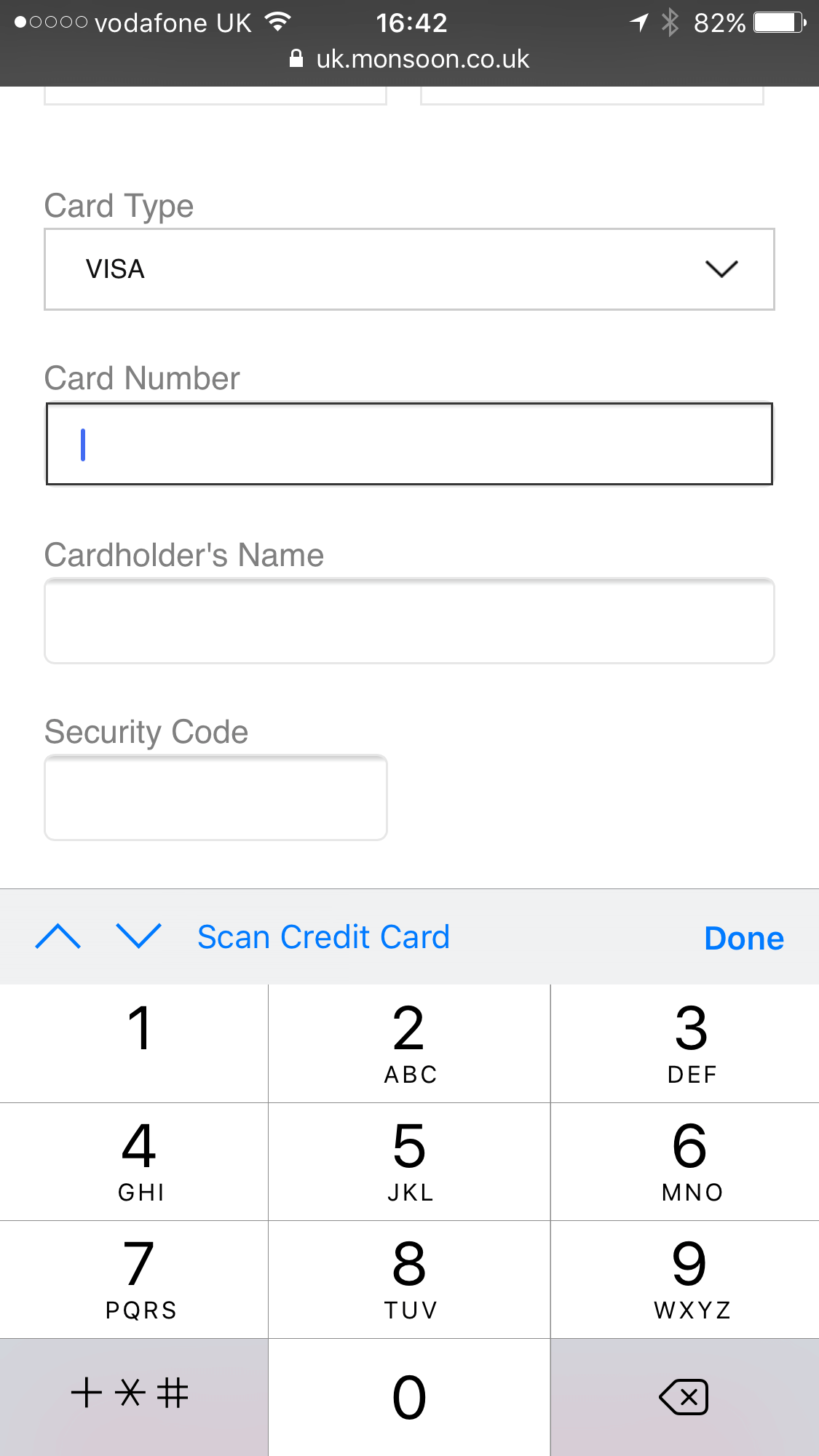
The payment page is also well designed for mobile, with input types adjusted for touchscreen users, here showing the numeric keyboard for the card number field.
Little details like this make a difference for users. It saves them the effort of changing the keyboard type, speeding up the process.
Note the ‘scan credit card’ option too. By using the smartphone camera to grab the card number and expiry date, it reduces the effort required by the shopper.
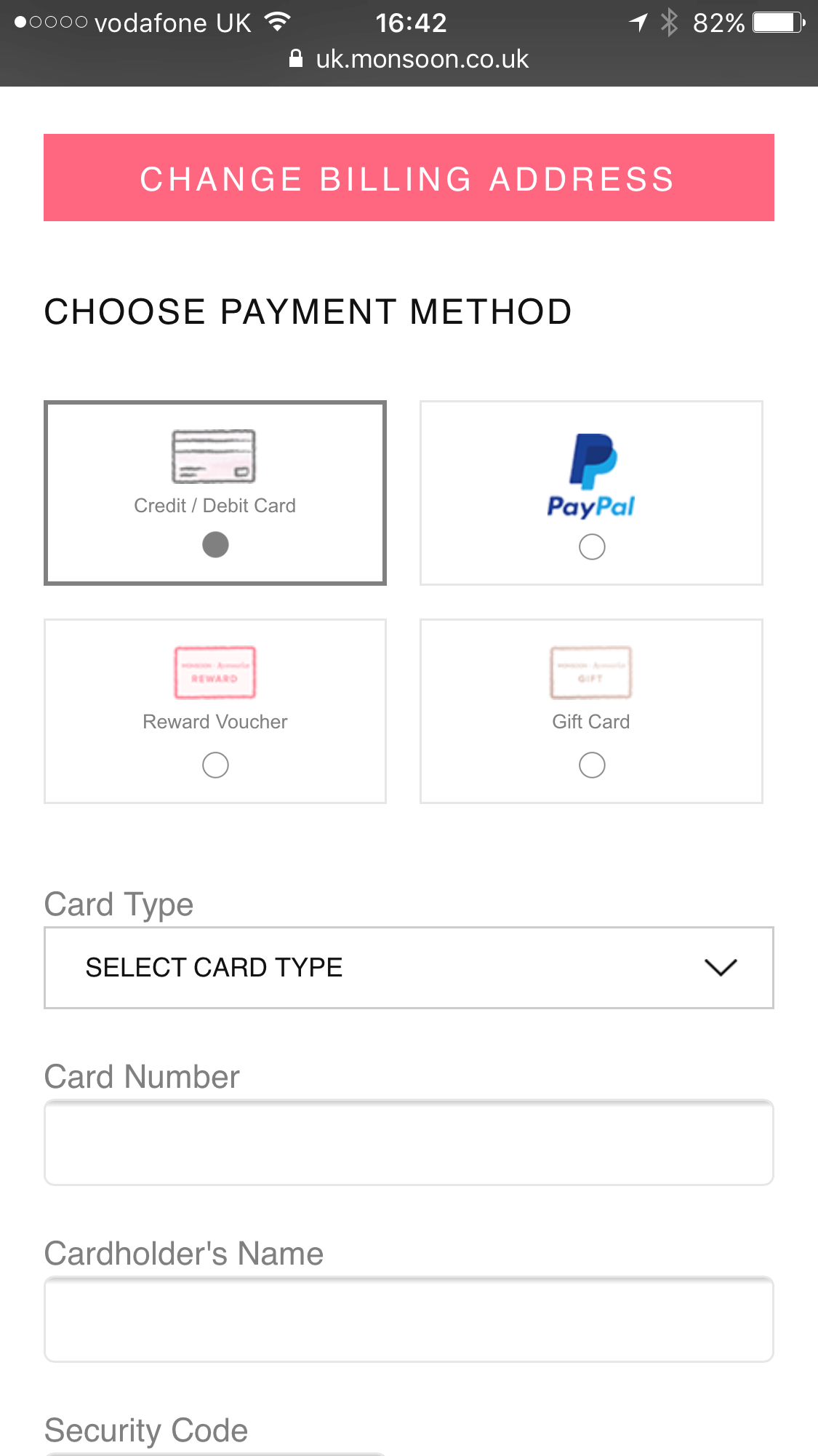
Monsoon also offers PayPal as an alternative to paying by credit or debit card.
This option can make payment easier for mobile users as the need only login to their PayPal account instead of entering card details. It’s also important to provide choice for shoppers to cover different customer preferences.
In Summary
Perhaps we could find fault if we look hard enough but overall Monsoon is a very good example of mobile best practice. It’s also typical of fashion sites on mobile.
The customer journey through the site is relatively easy, and with good form and checkout design it reduces the areas of friction which may deter customers.
While travel sites, for example, have a much greater challenge thanks to the relative length and complexity of the purchase and payment process, the principles of good practice still apply.
Travel sites can reduce abandonment rates through effective design – making forms easier to fill in, using shortcuts and features like defaulting to the correct input type to reduce the effort required of smartphone users.
NEW EBOOK
⬛️ 2023 Black Friday Ecommerce Strategy & Stats Report
This FREE ebook gives you the methods, solutions & trends for building a high-converting remarketing strategy for Black Friday

Speak to an expert
Learn how to convert your online audience into revenue with our experts.

Graham Charlton
Graham Charlton is Editor in Chief at SaleCycle. He's been covering ecommerce and digital marketing for more than a decade, having previously written reports and articles for Econsultancy. ClickZ, Search Engine Watch and more.


![Valentine’s Day Ecommerce Tips and Trends [2024 Strategy]](https://www.salecycle.com/wp-content/uploads/2019/01/valentines-ecommerce-1.png)


![How SaleCycle helped Vodafone increase their online sales by an additional 2,000 additional sales per month [Extended Version]](https://www.salecycle.com/wp-content/uploads/2023/08/vodafone-banner.webp)